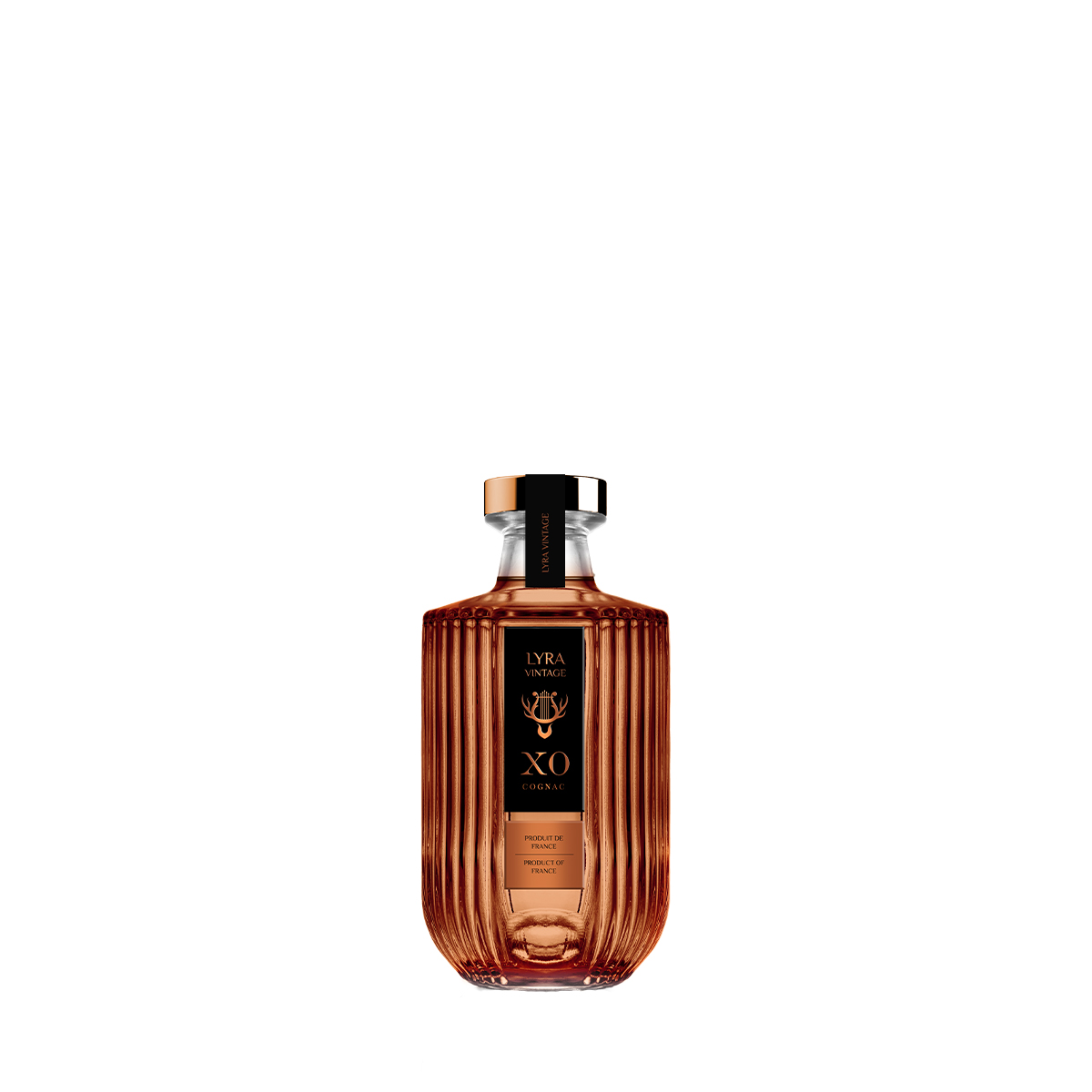
LYRA VINTAGE
500 ml, 700 ml

Customer
Topp d.o.o.
Brand
LYRA VINTAGE
Segment
Premium
Category
Spirits
Origin
Slovenia
Expertise
Packaging redesign, Design Studio
“The offered partnership by Hrastnik1860 means a lot to us, as they make exquisite high-quality products, which will help the sales to grow.”
SAMO KENDA, BERRYSHKA CEO
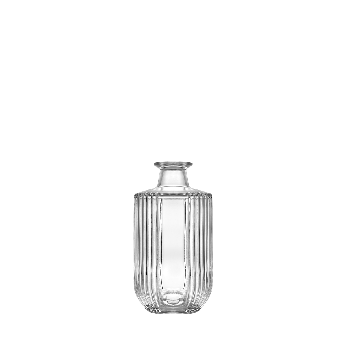
As a base for Berryshka Spirits our existing LYRA VINTAGE design was used.
Berryshka is a Slovenian family-owned producer of premium spirits and liqueurs, with roots in the forests of Kočevje. The Kenda family’s distilling story began in the 1990s, when they restored an abandoned distillery and started producing essential oils, followed by spirits and liqueurs.
Today, Berryshka is known for its gin, juniper spirits and fruit liqueurs. Its London Dry Gin, made with ten botanicals, has received international recognition and is one of the brand’s best-known products.
The brand brings together traditional distilling knowledge and a contemporary approach to spirits. Its identity is modern, elegant and energetic, while maintaining a connection to nature and its Slovenian origins.
Before the redesign, Berryshka used the same glass bottle across its different product categories. While this provided consistency, the company wanted packaging that would better communicate the character of its spirits and create a stronger visual identity across the range.
To explore the possibilities, Berryshka partnered with Vaider Group (formerly HRASTNIK1860) and its Design Studio on a comprehensive packaging redesign.
The starting point was the diversity of Berryshka’s portfolio. At the time of the project, the range included six liqueurs, three gins and three juniper spirits, covering different price categories and consumer preferences.
The challenge was to create packaging that could work across these products while retaining a recognisable connection to the Berryshka brand.
Vaider Group’s Design Studio developed four different proposals, ranging from existing collection bottles to entirely bespoke concepts.
The first proposal was inspired by the Saturn collection bottle, offering a similar shape with a lighter glass weight. The second explored Luna, a collection bottle combining modern styling with a more traditional character.
The third proposal introduced a new bespoke bottle with a tall, straight silhouette. The fourth took a different direction: a shorter, wider bespoke bottle inspired by the rounded shape of berries.
The proposals also explored different decorative possibilities, including embossing, bottle punts and surface details.
A recurring element was the leaf. Closely associated with berries, plants and the natural environment, it offered a visual connection to Berryshka’s origins. The leaf also carries traditional associations with growth and renewal, making it a fitting symbol for the brand’s new packaging.
Together, the four concepts gave Berryshka the opportunity to compare different approaches to shape, decoration and brand positioning before selecting a final direction.
Choosing between the four proposals was not straightforward. Each offered a different interpretation of Berryshka’s identity, from understated collection designs to more distinctive bespoke shapes.
Samo Kenda and the Berryshka team reviewed the proposals alongside the available decoration options, considering how each design could represent the brand and work across its product range.
The final direction led to a new bottle with a more elegant, contemporary appearance. Developed specifically for Berryshka, the design subsequently became known as **Lyra Vintage** within Vaider Group’s bottle collection.
The redesign also introduced a distinctive colour palette, giving individual products their own identity while maintaining a consistent bottle shape.
Berryshka London Dry Gin was presented in pastel green, BrinGin in white, Gin’N Berry in pink and Purfl Gin in pastel blue.
The combination of the Lyra Vintage bottle and its different colour treatments gave Berryshka a recognisable packaging family, with each expression clearly distinguished on the shelf.
For Berryshka, the project represented more than a change of bottle. It was an opportunity to bring the appearance of its spirits into closer alignment with the brand’s character, its product range and its connection to nature.
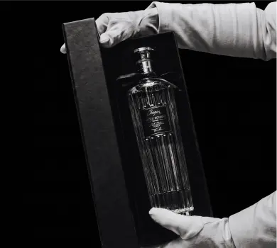
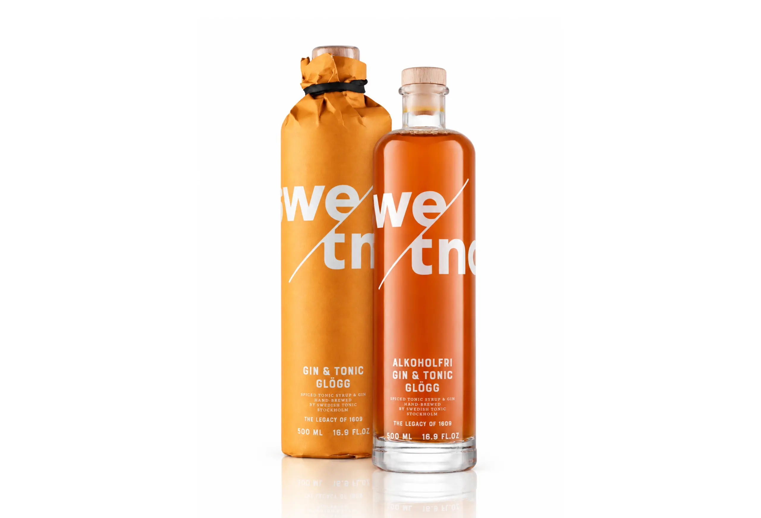
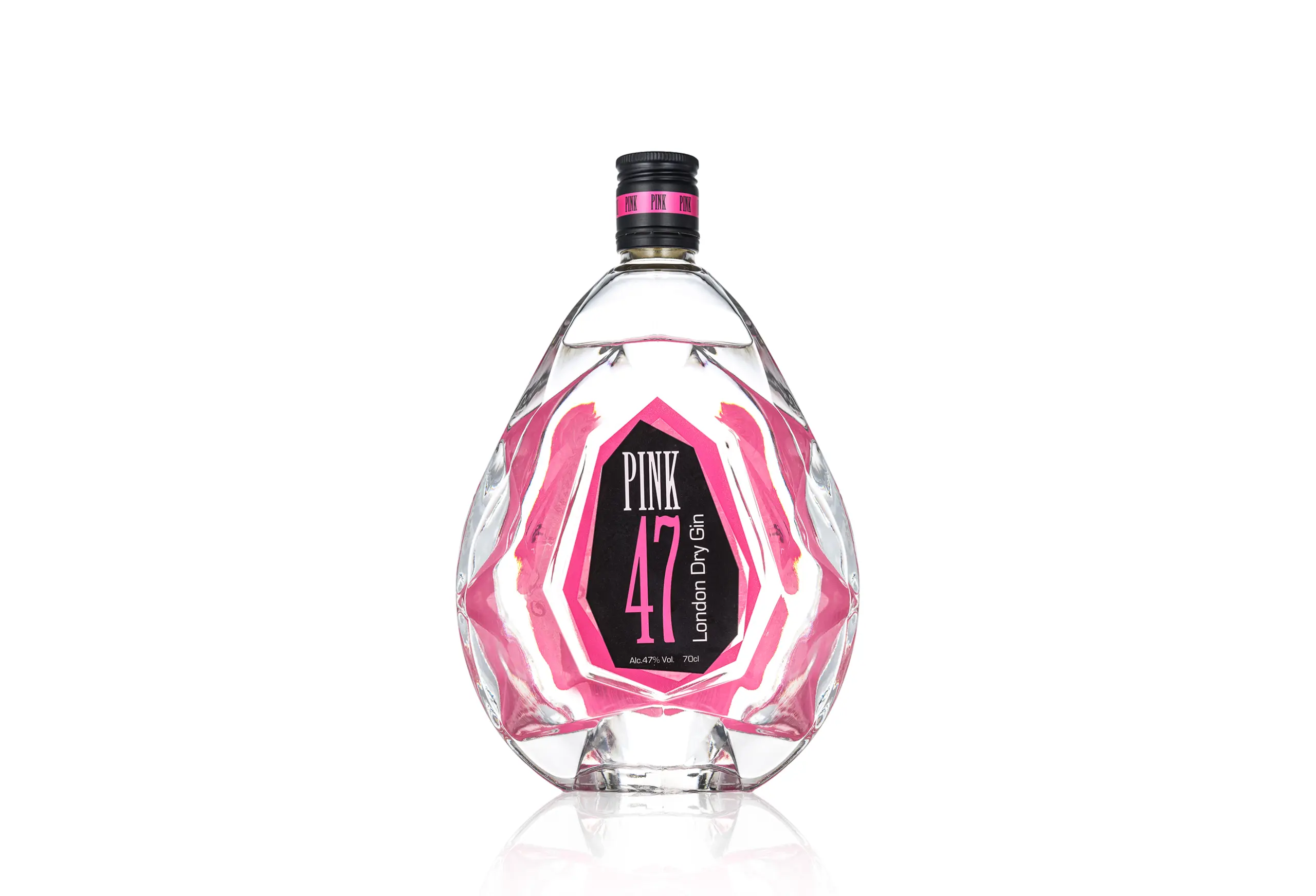
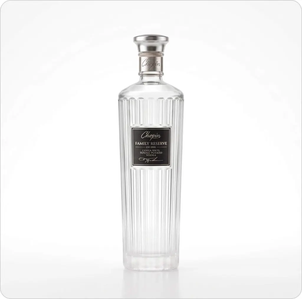

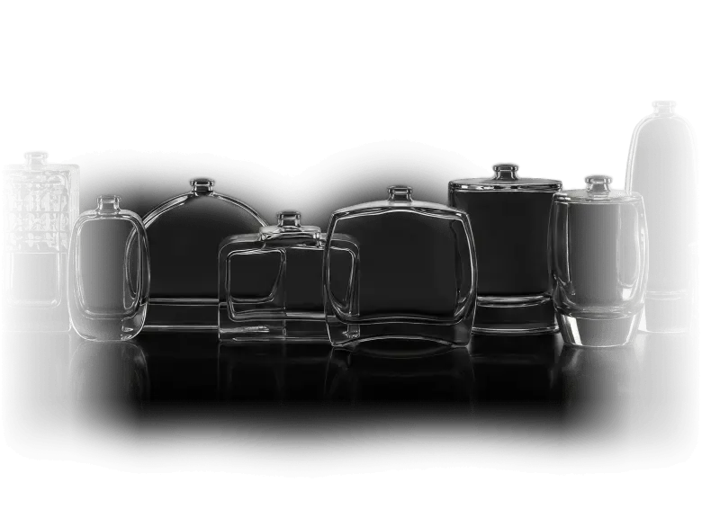
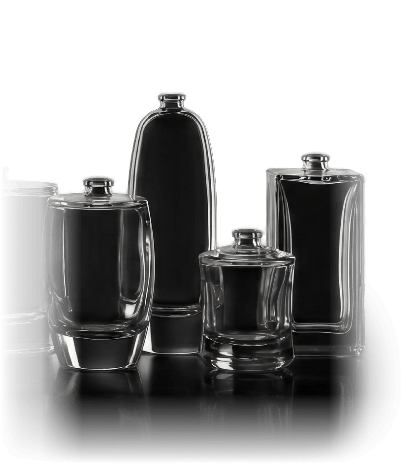
For your inspiration, a selection of possible directions created by our design team and
built on our existing products.
Berryshka Spirits
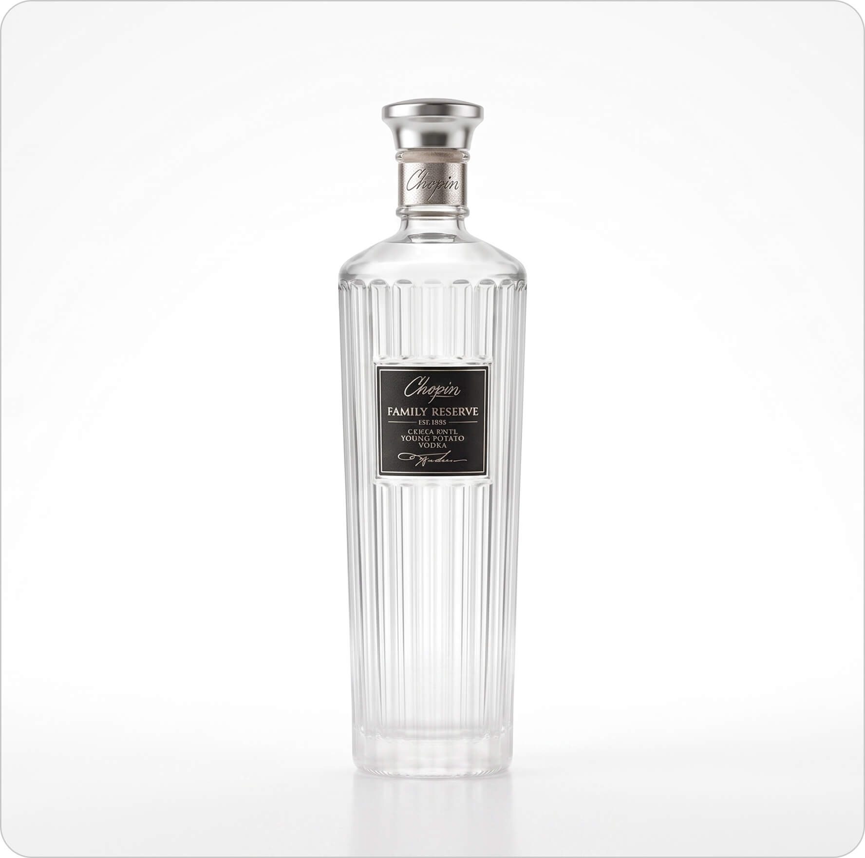
Chopin Vodka Family Reserve
Francoli Grappa
Frisky Panky: From Competition Winner to Bespoke Bottle
La Distillerie Générale
Markiza Rosé by Gašper Wines
Martell XO Cognac
Melifera Gin
Monologue Gin
Nongfu Spring Water
Olimia: A Bottle for a Precious Natural Resource
Pink 47 Gin
Project BEAR: Hybrid Regenerative Glass Furnace
RE◦Vine: Moving Beyond Sustainability
RE◦water bottle for JRE
Skënderbeu Brandy
Swedish Tonic Glögg
THE $KULL by Philipp Plein
For us, no project is too big and no detail too small.
Explore why we’re the right choice for your project.